By Marion Boddy-Evans
Question: The Fried Egg School of Painting Composition
“Is it a rule that the focal point of a painting should not be in the middle of the canvas? What if you have, let us say, a face with a crown on the head, nothing else other than the background, would that be wrong?” — Vivien S
Answer:I call a painting composition where everything is right in the middle the “The Fried Egg School of Painting Composition”. Overall, I’d say not doing so is a rule beginners should follow, but that it increasingly becomes a guideline rather than a rule the more experienced you are, and eventually irrelevant. Why? Simply because a central composition is the hardest to do successfully, so while you’re still learning to paint, don’t make things even harder for yourself.All too often, when the focal point or subject of the painting is placed in the center of the canvas, the painting’s composition ends up like a fried egg: there’s a small area that’s colorful and interesting to the eye right in the middle, with lots of blandness around it. When you look at the painting your eye goes straight into the center, never to emerge nor wander around the composition.
A central composition can be done successfully, and be very striking when it is, but you have to pay careful attention to every bit. For instance, how the structural lines of the composition lead the eye, how the colors work in compositional terms to link parts of the painting and lead the viewer’s eye. What and where the main focal point is, and what the secondary points are. A successful composition pulls the viewer’s eye into the focal point, but also makes it wander around to take in everything, eventually coming back to the focal point again.
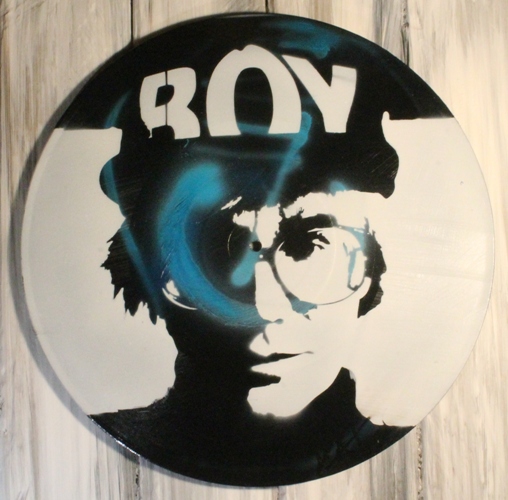
If you’ve putting a head in the middle of the painting, and having nothing else other than the background, I would plan a composition so the head is big enough to dominate the space. Avoid a small head floating around a large, empty background. With faces, we instinctively tend to look at the eyes. Having a crown on the head will pull the viewer’s gaze upwards, so balance this by the expression of the smile or a bit of clothing at the neck/shoulders. Tempt the viewer’s eyes to move across the whole composition.

Leave a Reply
You must be logged in to post a comment.